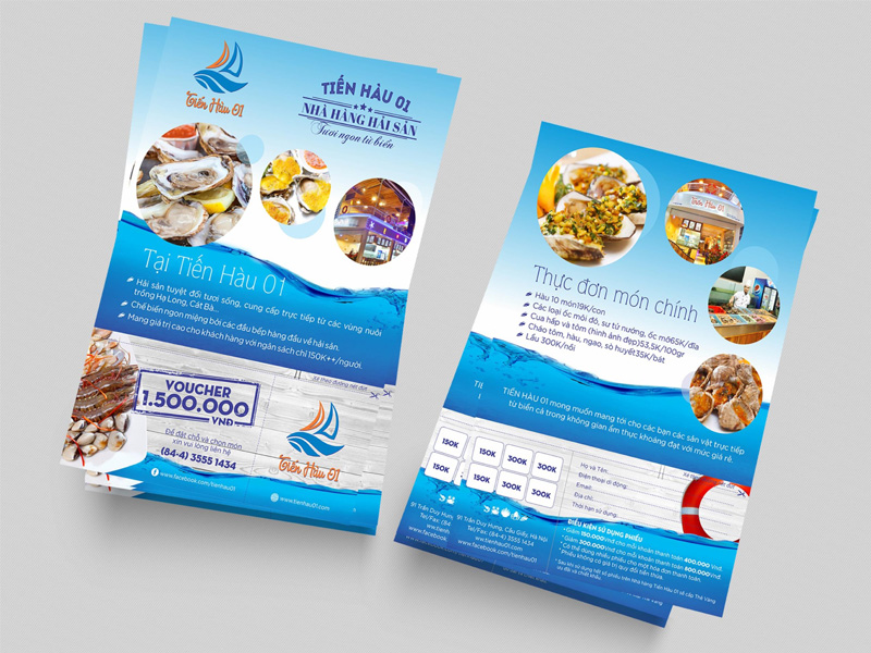
7 tips for designing beautiful catalog
With these simple tips, hope you will design is beautiful and creative catalog:
1. Use accents in design:
One of the easiest is probably best to use an image highlights strong in design. But usually we have many pictures or other design elements. Therefore we should design the arrangement and alignment of these elements so that they become a single unit image.

2. Align the design elements together or with grid axes:
Put the ingredients text and graphics on the page with a link to each other through the vertical and horizontal axis, aligning the objects in the center next to or part of them, to the complex layout we can use use grid lines to assist in the design. The human brain we tend to arrange an orderly and consistent.
3. Keep the balance to the design:
Please create a balance for design with text and images. We can use symmetric equilibrium as 2 or 4 columns of text symmetrical with an image element or asymmetric techniques to give designers more animated.

4. Apply the 1/3 rule:
- The most important factor in 1/3 lengthwise let or horizontal
- Or the most important factor to focus on the top or bottom third of the page
- Or the most important factor to focus on one point that junction after dividing axis 1/3 pages horizontally or vertically
5. Using techniques similar repeat in design:
Repetition should be homogeneous. VD use one color for related items such as subheadings, quote, footer or size .... graphic shapes, or simply put the pages in place in the entire document to design.

6. Add a space in the required position:
White space is also equally important other factors. Cramming too many design elements to the page even if it is consistent with the laws of balance, homogeneous. We should also use space sensibly say na is to design still has room to breathe again. The best position for the white space is the edge of the page so it does not get stuck in the middle of the page. We can apply these tips shrink the distance paragaph text or other graphics objects.
7. Emphasizing the differences between the design elements:
Several factors such as uniformity in the page margins, or color but would be somewhat monotonous. Let's make a difference by using techniques such contrasting color elements or larger, smaller in layout. Examples include the title simply bigger and different other texts, excerpts.
